
How to A/B Test Your Restaurant Menu Using QR Analytics
Discover how to use QR menu data to A/B test dishes, optimize pricing, and boost sales with actionable strategies for modern restaurants.
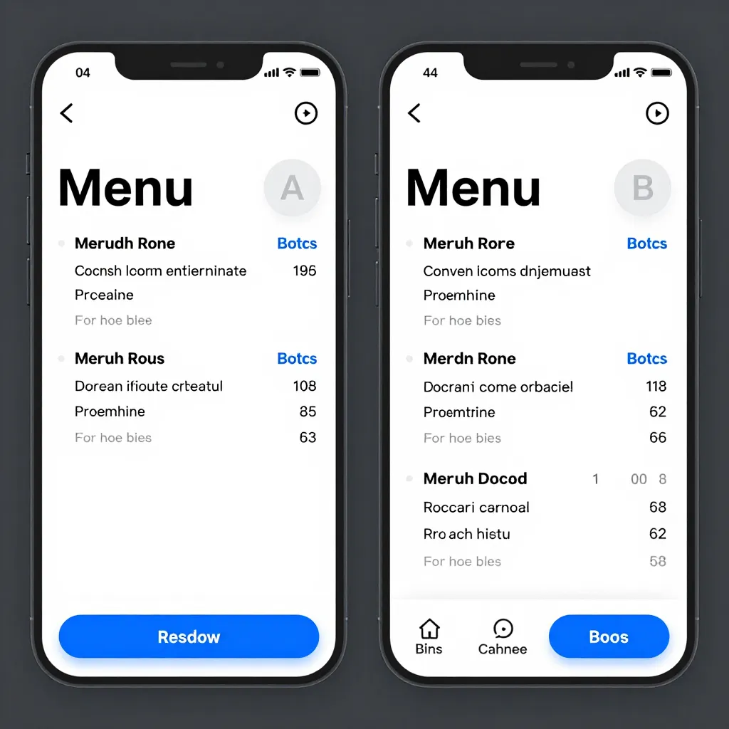
Why Digital Menus Are the Perfect Lab for A/B Testing
For decades, restaurant owners relied on intuition and gut feelings to decide what to cook, how much to charge, and which promotions to run. Today, that approach is rapidly becoming obsolete. The shift to digital menus via QR codes has transformed your dining room into a sophisticated data laboratory. Unlike static paper menus that gather dust after a few hours of use, a digital menu hosted on a platform like upQR captures real-time behavioral data from every single guest.
This digital transformation allows you to move from reactive management to proactive optimization. By leveraging the analytics built into your QR system, you can conduct A/B tests-comparing two versions of a variable to see which performs better-with unprecedented speed and accuracy. Whether you are testing a new dish, adjusting a price point, or changing a photo, the data you collect tells a clear story about what your customers truly want.
The benefits of this data-driven approach extend far beyond simple guesswork. According to industry research, restaurants that utilize digital menu boards and analytics see a significant increase in average check size and table turnover. By understanding exactly which items drive traffic and which ones sit untouched, you can streamline your kitchen operations, reduce food waste, and ultimately increase your profit margins. The following guide will walk you through the essential steps of setting up and analyzing these tests to elevate your business.
Setting Up Your First A/B Test with upQR
Before diving into complex analytics, you must establish a clean baseline. The most common mistake restaurant owners make is launching a test without isolating the variable they want to measure. If you change the price of a burger and simultaneously run a social media ad campaign, you won't know if the sales spike was due to the price drop or the ad. To get valid results, you must change only one element at a time.
Here is a practical framework for setting up your test using upQR's capabilities:
- Define Your Hypothesis: Start with a clear question. For example, "Will lowering the price of our signature soup by $1 increase the number of orders by 15%?" or "Do customers order the 'Spicy Tuna Tartare' more often when the photo shows the garnish?" Having a specific goal ensures your test is meaningful.
- Segment Your Data: upQR allows you to view analytics by location, time, and device. If you have multiple branches, you can test a new item in one location while keeping the other as a control group. Alternatively, you can split your data by time of day, testing a new lunch special during the week while monitoring standard sales on the weekend.
- Create the Variant: Using your upQR dashboard, create a specific version of the menu item or the entire menu layout. You might add a new high-resolution photo, toggle a discount badge on an item, or rewrite the description to highlight a specific ingredient. Ensure the control version (the original) remains unchanged.
- Launch Simultaneously: Deploy both versions to your QR code links. If you are testing different menu layouts or item placements, ensure the QR code links to a dynamic URL that can serve different content based on your testing parameters. This ensures that the only difference a customer sees is the one you intend to measure.
It is crucial to run these tests for a sufficient duration to gather statistically significant data. A test run for just two hours might not account for the influx of lunch crowds or the lull of early afternoon. Aim to run tests for at least 3-5 days to capture data across different days of the week and varying customer demographics.

Key Metrics to Track for Menu Optimization
Once your test is live, you need to know what to look at. UpQR's analytics dashboard provides a suite of metrics that go far beyond simple "sales" numbers. To derive actionable insights, you must focus on specific key performance indicators (KPIs) that directly impact your bottom line.
Click-Through Rate (CTR) and View Duration: Before a customer orders, they are browsing. Track how many times an item is viewed versus how many times it is ordered. If an item has a high view count but a low order count, there is a disconnect between the presentation and the reality of the dish. Perhaps the photo is misleading, or the price is still too high despite your expectations. Conversely, if an item has a low view count, your menu layout or description might need a refresh to grab attention.
Conversion Rate: This is the most critical metric. It represents the percentage of customers who view an item and actually add it to their cart. If you are testing a new photo for a steak, and the conversion rate jumps from 10% to 18%, you have successfully proven that the visual appeal drives sales. This metric is essential for validating the effectiveness of your photography and descriptions.
Average Order Value (AOV) Impact: Sometimes, the goal of a test isn't to sell more of a specific item, but to increase the overall value of the check. If you test adding a "pairing suggestion" (like a specific wine or side) to a menu item, watch how the AOV changes. If customers are more likely to add the pairing when the suggestion is prominent, you have found a new revenue stream without needing to create new dishes.
Abandonment Rates: Digital menus often suffer from "cart abandonment." This happens when a customer views an item, adds it to their cart, but then navigs away before paying. High abandonment rates on a specific item could indicate a hidden allergen concern, a confusing description, or a price shock at the final checkout screen. Identifying these friction points allows you to smooth out the customer journey.
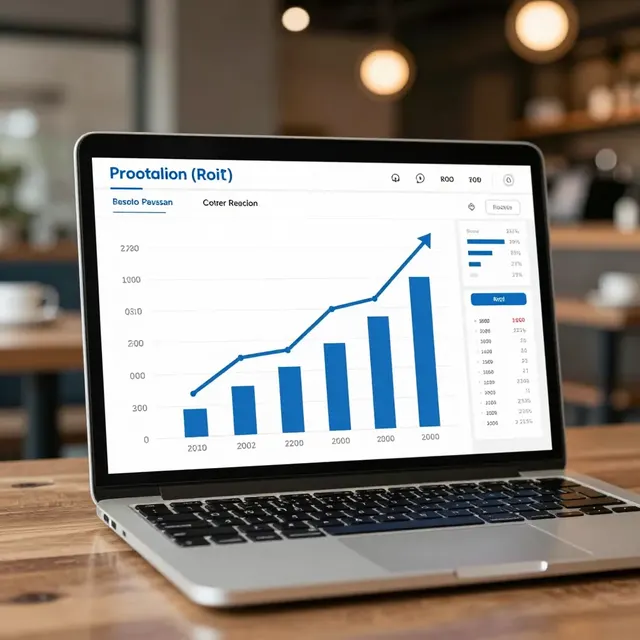
Real-World Examples of Successful Menu Tests
To illustrate the power of these analytics, let's look at three real-world scenarios where restaurants have used upQR data to solve specific problems. These examples demonstrate how data can turn vague ideas into concrete business strategies.
Case Study 1: The "Hero Dish" Rebranding
A trendy cafe in downtown Seattle was struggling to sell their "Avocado Toast." They suspected the price was the issue, but lowering the price felt risky. Instead, they conducted an A/B test. Version A showed the toast with a plain background and the standard price. Version B featured a high-quality, close-up shot of the toast with a visible sprinkle of chili flakes and a slightly more descriptive name: "Spicy Chili Avocado Toast." The analytics showed that while the view count was similar, the conversion rate for Version B was 35% higher. The data revealed that the presentation and the hint of spice were the selling points, not the price. They kept Version B, and sales of the item tripled within a month.
Case Study 2: The Allergen Transparency Test
Health-conscious diners are increasingly concerned about ingredients. A burger joint wanted to know if explicitly listing allergens in the description would deter customers or build trust. They tested a version of the menu that listed "Contains: Gluten, Dairy, Soy" prominently next to the burger against a version that hid this info. Surprisingly, the version with full transparency saw a 12% increase in orders. The data suggested that customers felt safer and more confident ordering when they had full information, aligning perfectly with upQR's core value of honesty. They removed the hesitation from their descriptions, leading to a more relaxed dining experience for everyone.
Case Study 3: Pricing Psychology
A restaurant owner wanted to test the "left-digit effect" (e.g., $9.99 vs $10.00) on their appetizers. They created two menu layouts where the only difference was the pricing format for the same items. The analytics tracked the conversion rate for each item. The results showed a 20% uplift in sales for the $9.99 pricing format. This simple change, validated by hard data, allowed the owner to adjust pricing across their entire menu without losing perceived value.
Best Practices for Sustainable and Ethical Testing
As you refine your menu based on data, it is important to remember that upQR is built on a foundation of sustainability and ethical business practices. Your A/B testing should reflect these values. For instance, if a test reveals that a popular dish is actually driving significant food waste due to preparation errors, use the data to adjust your recipe or portion sizes rather than simply increasing the price. Reducing waste is a direct contribution to environmental health, a core mission of the digital menu revolution.
Furthermore, transparency in your tests can enhance customer trust. If you are testing a new seasonal item, you can use the menu to explain that you are "curating the best seasonal flavors" and invite customers to vote on future additions. This turns a corporate metric into a community engagement opportunity. Always ensure that the data you collect is used to improve the customer experience, not to manipulate them with hidden fees or misleading descriptions. The goal is to create a menu that is honest, accurate, and universally accessible.
When designing your tests, consider accessibility as a variable. Does your digital menu work seamlessly for screen readers? Are the fonts large enough? If you are testing a new layout, ensure it does not introduce barriers for visually impaired customers. A truly optimized menu is one that everyone can enjoy, regardless of their abilities or dietary needs. This commitment to universal access strengthens your brand and expands your potential customer base.
Finally, document every test. Keep a log of what you changed, the duration of the test, the metrics observed, and the final decision. Over time, this log will become a valuable asset, showing you exactly what works for your specific audience. You will stop guessing and start knowing, allowing you to allocate your resources more efficiently and focus on creating delicious food that people love.
Conclusion: Turn Data into Delicious Success
The evolution of restaurant management is no longer optional; it is essential for survival and growth. By utilizing the analytics provided by platforms like upQR, you gain a powerful lens into customer behavior that was previously invisible. A/B testing your menu items allows you to make informed decisions that boost sales, reduce waste, and enhance the dining experience.
Whether you are optimizing a single photo, refining a price point, or testing a new layout, the data speaks clearly. It tells you what your customers want, what they value, and where there is room for improvement. Embrace this data-driven approach to transform your restaurant into a model of efficiency and customer satisfaction. With upQR, you have the tools to build a menu that is not only delicious but also smart, sustainable, and transparent.

Related Posts
Ready to create your digital menu?
Create your QR menu in minutes and reach your customers in any language.