Best Fonts and Colors for Digital Restaurant Menus
Discover the perfect font pairings and color schemes to boost readability, brand identity, and sales in your digital QR menu. Expert tips included.
Why Typography and Color Matter in Digital Menus
In the world of digital dining, your menu is often the first physical or digital touchpoint a customer has with your brand. Unlike a printed paper menu, a digital QR code menu lives on a smartphone screen, where lighting conditions, screen glare, and varying device capabilities can drastically affect how your content is perceived. This is why selecting the right fonts and colors is not just an aesthetic choice; it is a critical operational decision that impacts readability, ordering speed, and ultimately, revenue.
According to a study by the Nielsen Norman Group, users abandon websites that load slowly or are difficult to read within seconds. In a restaurant context, if a customer struggles to read your menu items due to poor font choice or bad contrast, they are likely to order from a competitor or decide not to order at all. The average customer spends less than two minutes deciding what to order, so your design must communicate instantly and clearly.
Furthermore, digital menus offer a unique opportunity to leverage accessibility standards. By choosing high-contrast colors and legible typefaces, you ensure that customers with visual impairments can navigate your menu comfortably. This inclusivity not only broadens your customer base but also aligns you with modern ethical standards in the hospitality industry. When you optimize for readability, you reduce friction in the ordering process, allowing your kitchen to prepare orders faster and your staff to spend less time explaining menu items.
Choosing the Right Typeface for Your Brand Identity
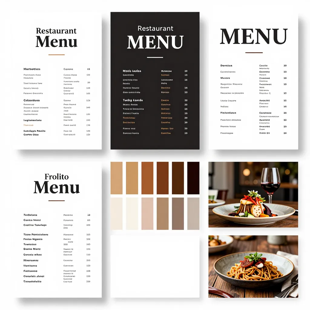
Typography is the voice of your menu. Just as a spoken tone conveys emotion, fonts convey the personality of your restaurant. However, the "best" font is subjective and depends heavily on your specific concept. A fine-dining steakhouse requires a vastly different approach than a bustling taco stand or a cozy coffee shop.
Serif vs. Sans-Serif: The Classic Debate
Traditionally, serif fonts (those with small lines attached to the end of strokes) like Times New Roman or Garamond are associated with print media, newspapers, and elegance. They work beautifully for wine lists or fine dining menus where a sense of tradition and sophistication is key. However, on digital screens, serif fonts can sometimes appear cluttered or hard to read if the size is too small or the screen resolution is low. For digital menus, sans-serif fonts (clean, simple strokes without extra lines) are often the superior choice. Examples include Roboto, Open Sans, or Montserrat. These fonts are engineered specifically for screen readability and maintain clarity even at small sizes.
The Power of Display Fonts
For headlines and section headers, you can get away with more decorative fonts to add character. A script font for a bakery menu can evoke the feeling of a handwritten note, while a bold, geometric sans-serif can signal modernity and speed. The key rule is hierarchy: your body text must be highly readable, while your headers can be expressive. Never use more than two or three font families in a single menu to avoid visual chaos.
Real-World Example
Consider a trendy burger joint named "The Grilled Cheese." Their brand is casual, fast, and fun. Using a heavy, rounded sans-serif font for their headers and a clean, simple font for the ingredient lists creates a vibe that matches their food. Conversely, a Michelin-star French restaurant might use a custom serif font that mimics calligraphy for their headers to emphasize artistry, paired with a highly legible, neutral sans-serif for the descriptions of the truffle risotto. The goal is always to match the font weight and style to the expected dining duration and atmosphere.
Color Psychology and Accessibility Best Practices
Color is the second most important element of your menu design. It sets the mood, directs the eye, and influences appetite. However, many restaurant owners make the mistake of prioritizing brand colors over functionality. A menu that looks great on a designer's monitor might be impossible to read on a bright outdoor patio or a dimly lit booth.
Background Colors: Keep It Neutral
The safest and most effective background color for any digital menu is white or a very light gray (like #F5F5F5). White backgrounds provide the highest contrast for text, ensuring that black or dark gray text pops clearly. While some restaurants try to use their brand color (e.g., a bright red or blue) as the background, this often leads to readability issues. If you must use a colored background, ensure it is very light and pair it with dark text. Avoid dark backgrounds with light text unless the ambient lighting is extremely low, as this can cause eye strain.
Text Colors and Contrast Ratios
The American Printing Institute (API) recommends a contrast ratio of at least 4.5:1 for normal text to be considered accessible. For large text, a ratio of 3:1 is acceptable, but for a menu where customers are scanning quickly, aim for the higher standard. This means avoiding light gray text on a white background or dark text on a yellow background. Instead, use pure black (#000000) or very dark charcoal (#333333) for your primary text. This ensures that even if a customer's phone screen is dirty or the ambient light is harsh, the text remains legible.
Using Color to Highlight
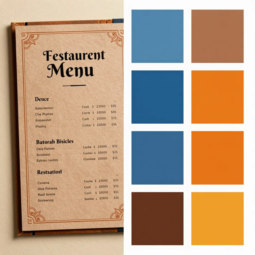
Color should be used strategically to guide the customer's eye, not just for decoration. You can use a specific accent color (like your brand's orange or green) to highlight "Chef's Picks," "Spicy" items, or "Vegetarian" options. This helps customers scan the menu faster. However, be careful not to use too many colors. A menu with five different colors for different categories can look cluttered and confusing. Stick to a palette of two or three colors maximum: one for the background, one for the main text, and one for accents.
Optimizing for Different Dining Environments
One size does not fit all when it comes to menu design. The environment in which your customers view your menu dictates your design choices. A digital menu viewed in a busy lunch rush operates under different constraints than one viewed during a relaxed dinner service.
The Outdoor Patio Challenge
Customers sitting outside often view menus in bright sunlight. Smartphone screens can suffer from glare, and the sunlight can wash out colors. In this scenario, high-contrast designs are non-negotiable. A dark background with neon text will fail completely in sunlight. Instead, opt for a white background with black text. If you need to use images or icons, ensure they are high-contrast and not washed out by the sun. Avoid pastel colors or low-saturation images, as they will blend into the glare.
The Dimly Lit Dining Room
Conversely, in a cozy, dimly lit restaurant, a stark white background can sometimes feel too clinical or bright. In these cases, a very light cream or off-white background can reduce eye strain while maintaining readability. The key is to ensure the text color is dark enough to stand out against the lighter background. Test your menu design in low-light conditions before launching; ask a friend to view it on their phone in a dark room to see if the text is still easy to read.
Mobile Responsiveness and Loading Speed
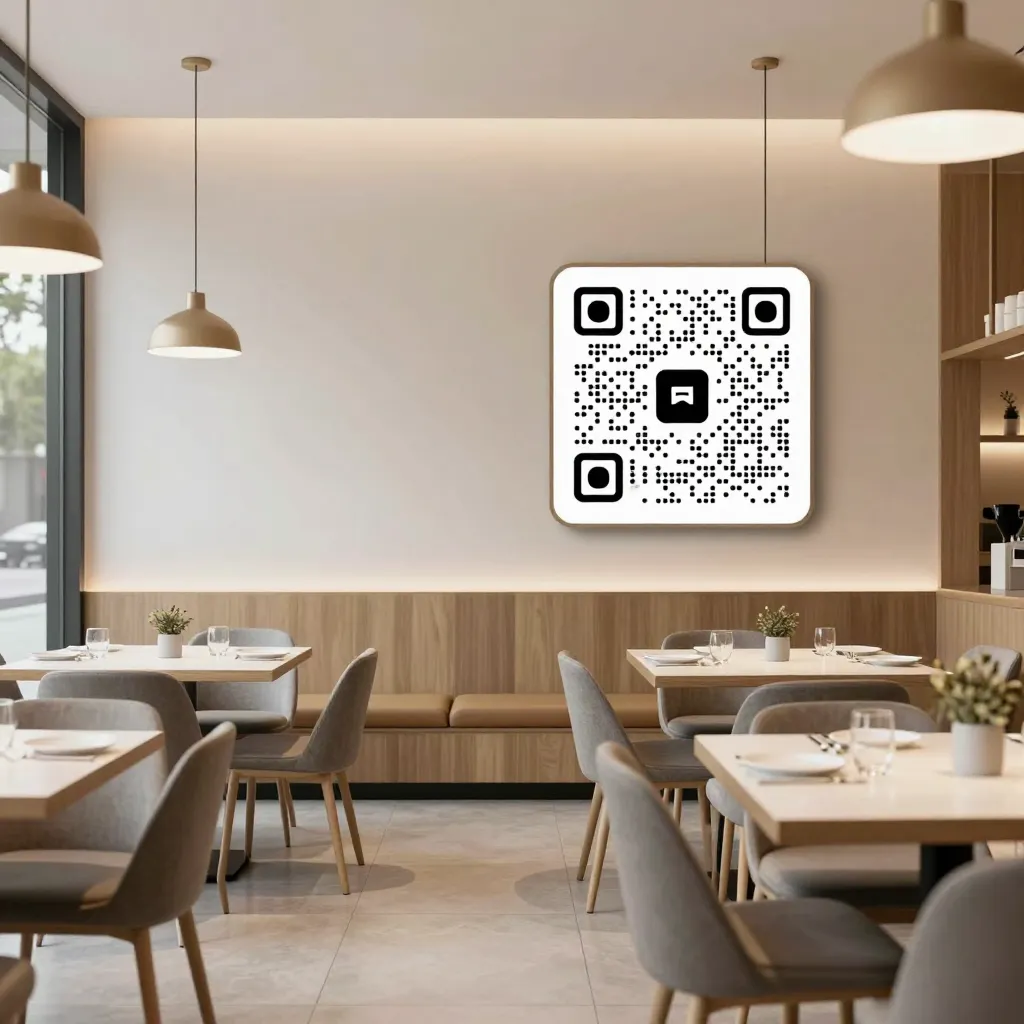
When choosing fonts and colors, remember that your menu is likely being accessed via a mobile device. Large, complex images with heavy gradients or animated colors can slow down loading times, which frustrates customers. Keep your design clean. Use flat colors rather than complex gradients. Ensure that your font sizes are large enough (minimum 16px for body text) to be read without zooming. A slow-loading, hard-to-read menu is a lost sale. Platforms like upQR handle the technical optimization of these elements, ensuring your design renders perfectly on any device, from the latest iPhone to an older Android tablet.
Practical Steps to Test Your Menu Design
Before you finalize your digital menu design, it is essential to test it rigorously. What looks good to you might not look good to your customers. Here is a simple checklist to validate your font and color choices:
- The Distance Test: Stand three feet away from your screen and try to read the smallest font size you intend to use. If you have to squint, the font is too small for the distance customers will be holding their phones.
- The Glare Test: Turn on your phone's maximum brightness and hold it under a lamp or in a sunny window. If the text becomes invisible, your contrast ratio is too low.
- The Print Test: Print a sample of your menu on standard paper. If it looks good on paper, it will almost certainly look good on a screen, as paper has a matte finish similar to many phone screens. If it looks bad on paper, it will likely be unreadable on a screen.
- The Accessibility Check: Use free online tools to check your color contrast ratios. Ensure that your accent colors (like those used for "New" tags) are not too light against the background.
Don't forget to gather feedback from your staff. They are the ones who will be managing the menu on a daily basis. Ask them if they can read the small print quickly while standing in a noisy, busy kitchen. If they struggle, simplify the design. Remember, the goal is to make the ordering process as seamless as possible for the customer, which allows your staff to focus on service rather than troubleshooting a confusing menu.
Leveraging Professional Tools for Flawless Execution
While understanding the principles of typography and color is crucial, executing them perfectly requires the right tools. Creating a custom QR menu from scratch can be time-consuming and prone to errors. This is where specialized digital menu platforms become invaluable.
Platforms like upQR are designed specifically for the restaurant industry, offering templates that adhere to best practices in design and accessibility. These platforms allow you to customize fonts and colors without needing advanced design skills. You can select from a library of professionally curated fonts that are optimized for screens and choose color palettes that ensure high contrast. Furthermore, these tools often include features like automatic image optimization, ensuring that your high-quality photos load instantly without slowing down the menu.
By using a platform like upQR, you gain access to features that go beyond simple text and color selection. You can integrate inventory management, so your menu updates automatically when an item runs out, and you can add interactive elements like reservation buttons or loyalty program sign-ups. The focus on user experience is central to these platforms, ensuring that your digital presence is as polished and professional as your physical dining room.
Ultimately, the best font and color combination is one that your customers can read instantly, regardless of their device or environment. It is a combination that reflects your brand's personality without sacrificing clarity. By prioritizing readability and accessibility, you not only improve the customer experience but also streamline your operations. Whether you are running a casual coffee shop or a high-end bistro, the principles of good design remain the same: keep it simple, keep it readable, and let your food do the talking. With the right tools and a bit of testing, you can create a digital menu that converts browsers into buyers every single day.
Related Posts
Ready to create your digital menu?
Create your QR menu in minutes and reach your customers in any language.
