The Best Color Schemes for Cafe Menus: A Designer's Guide
Discover how strategic color choices in digital menus boost appetite, ensure accessibility, and reflect your brand identity using upQR.
Understanding the Psychology of Color in Food Service
Color is not merely an aesthetic choice; it is a powerful psychological trigger that influences customer behavior, appetite, and brand perception. In the digital realm of QR menus, color plays an even more critical role than on printed paper, as it must function across various screen types and lighting conditions. Research from the International Journal of Gastronomy and Food Science suggests that color temperature and saturation can alter taste perception by up to 10% in consumer trials. For instance, warm tones like orange and red are scientifically linked to increased heart rates and a faster turnover of tables, while blues and greens promote relaxation and longer dining experiences.
When designing a digital menu, the goal is to create an immediate emotional connection. A well-chosen color palette can subconsciously signal the type of cuisine you offer. Warm hues like amber, terracotta, and deep reds often evoke feelings of comfort and warmth, making them ideal for cafes serving hearty breakfasts, pastries, or traditional comfort foods. Conversely, cool tones like slate blue, sage green, and charcoal grey suggest freshness, health, and modernity, perfect for establishments focusing on organic ingredients, smoothies, or plant-based options. The challenge lies in balancing these psychological effects with your specific brand identity, ensuring the colors do not clash with your logo or the natural beauty of the food photography.
Accessibility and Universal Design: The Ethical Imperative
One of upQR's core values is universal access, ensuring that every customer, regardless of ability, can enjoy the menu experience. This principle extends deeply into the choice of color schemes. A common pitfall in menu design is poor contrast between text and background. According to the Web Content Accessibility Guidelines (WCAG), a contrast ratio of at least 4.5:1 is required for normal text to be readable by individuals with visual impairments. Many restaurant owners prioritize aesthetic trends over this critical standard, using dark grey text on a black background or white text on a light yellow background, which renders the menu nearly impossible to read for those with low vision or color blindness.
To uphold our value of transparency and honesty, we must ensure that our digital tools do not exclude anyone. A designer's guide must therefore emphasize high-contrast pairings. Instead of using pure black (#000000) and pure white (#FFFFFF), which can cause eye strain and reduce readability, opt for softer, high-contrast combinations. For example, a dark navy blue background with off-white text (#F5F5F5) provides excellent readability while maintaining a sophisticated look. Similarly, ensuring that color is not the sole indicator of allergens or dietary information is vital. Relying solely on color to denote 'gluten-free' or 'vegan' items can alienate users with color vision deficiency. Instead, use icons, distinct borders, or text labels alongside color coding. By prioritizing accessibility, you demonstrate respect for your entire customer base, reinforcing the upQR mission of creating a universal space where everyone knows exactly what they are ordering.
Creating Harmony: Practical Tips for Digital Palettes
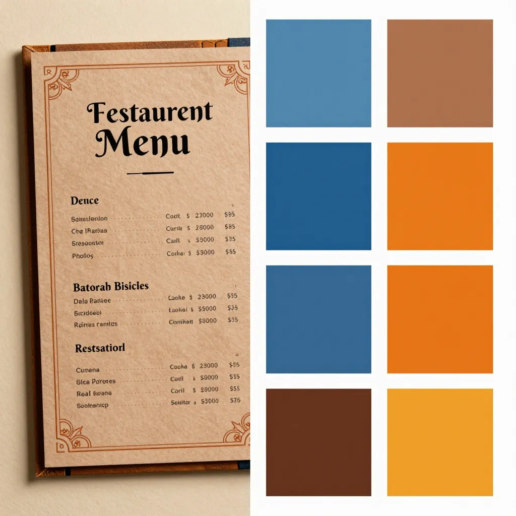
Selecting a color scheme for a digital menu requires a strategic approach that differs from print design. Digital screens emit light, which affects how colors appear. A color that looks vibrant on a printed flyer might appear washed out or muddy on a smartphone screen. To achieve harmony, designers should adhere to the 60-30-10 rule, a classic design principle adapted for digital interfaces. The 60% of your menu should be your dominant color, usually the background or the most neutral tone. The 30% should be your secondary color, used for sections, headers, or decorative elements. The remaining 10% is your accent color, reserved for call-to-action buttons like 'Order Now' or highlighting special offers.
For a cafe specializing in artisanal coffee and espresso drinks, a palette dominated by deep browns, creams, and warm beiges creates a cozy, inviting atmosphere that mirrors the product. However, if you want to highlight the freshness of your ingredients, introduce pops of green or bright orange as accents. It is crucial to test your palette against actual food photography. If your background is too busy or colorful, it will compete with the food images, making the dish look less appealing. A neutral, dark background often makes food photography pop, allowing the natural colors of the ingredients to stand out. This honesty in presentation aligns with our commitment to providing accurate information without deceptive visuals. Furthermore, consider the mood you want to set. A minimalist palette with plenty of negative space can make a small cafe feel expansive and modern, while a rich, saturated palette can make a space feel intimate and exclusive. Always remember that the menu is an extension of your physical space; if your cafe has exposed brick walls and warm lighting, a matching digital palette will create a seamless transition from screen to table.
Color Trends That Build Trust and Modernity
In the rapidly evolving landscape of digital dining, staying current with color trends helps maintain a brand's relevance without sacrificing the core values of sustainability and transparency. Current trends favor earthy, organic tones that reflect the increasing consumer demand for eco-friendly and locally sourced products. Shades of moss green, clay, and sand not only resonate with the 'green' movement but also convey a sense of natural purity. These colors are inherently sustainable in their digital form, as they do not require the physical resources of printing ink, aligning perfectly with upQR's environmentally conscious mission.
Another significant trend is the use of 'neo-brutalism' in web design, characterized by high contrast, bold borders, and unfiltered colors. While this style can be polarizing, it works exceptionally well for cafes that want to project a raw, authentic, and no-nonsense image. This approach fits our value of honesty; the design does not try to hide behind filters or soft-focus imagery but presents the brand and the food with clarity. However, when adopting bold trends, ensure they do not compromise readability. The key is to use these trends in moderation, perhaps in the UI elements like buttons or icons, while keeping the main content area clean and focused on the food. Data from recent user interface studies shows that users spend less than three seconds scanning a menu before deciding what to order. Therefore, the color scheme must facilitate quick scanning. High-saturation colors used effectively can guide the eye to the most popular items or seasonal specials, but they must be used with restraint to avoid visual clutter. A balanced approach ensures that the menu remains a tool for decision-making rather than a source of confusion.
Implementing Your Palette with upQR's Customization Tools
Choosing the perfect color scheme is only half the battle; implementation is where the magic happens. upQR is designed to empower restaurant owners with the flexibility to customize their digital menus without needing a professional graphic designer. Our platform allows you to upload your own brand assets or select from a library of professionally curated themes that adhere to accessibility standards. When setting up your menu, you can easily adjust the background color, text color, and accent colors to match your specific brand identity.
To get started, begin by defining your primary brand color from your logo. If your logo features a specific shade of blue, ensure that this blue appears in your menu's secondary color. Then, choose a background that complements it. If you are unsure about contrast ratios, upQR provides tools to preview how your text looks against different backgrounds before you go live. This feature is invaluable for avoiding the common mistake of choosing a background color that is too similar to the text color. Additionally, you can create dynamic sections. For example, use a darker background for the 'Drinks' section to distinguish it from the 'Food' section, using a lighter background for the 'Breakfast' items. This visual separation helps customers navigate the menu intuitively.
Remember that the goal of your digital menu is to enhance the dining experience, not to distract from it. By using upQR's customization tools, you can achieve a professional look that reflects your cafe's personality while maintaining the high standards of accessibility and sustainability we champion. Whether you choose a monochromatic scheme for a minimalist vibe or a vibrant, multi-colored palette for a playful cafe, the ability to tweak these elements in real-time ensures your menu evolves with your business. This adaptability is a key advantage of a digital solution over static printed menus, allowing you to respond to seasonal trends or special events instantly. Ultimately, a thoughtfully designed color scheme on upQR transforms a simple list of items into an engaging storytelling tool that invites customers in, educates them about your ingredients, and encourages them to make better, more informed choices about what they eat.
Related Posts
Ready to create your digital menu?
Create your QR menu in minutes and reach your customers in any language.