Design QR Menus That Work on Any Smartphone
Master mobile-first design to create QR menus that load instantly and convert. Learn the essential UX rules for every device.
Why Mobile-First Design Is Non-Negotiable for Restaurants
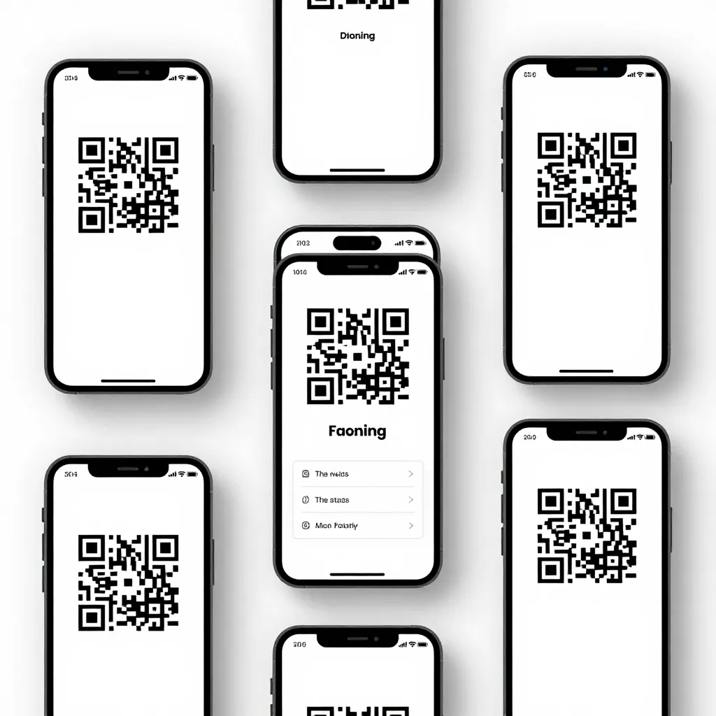
When a customer scans a QR code, they are immediately handing over control of their browsing experience to your digital interface. If that experience lags, looks cluttered, or fails to load on an older device, you risk losing a sale before the menu even opens. According to recent industry data, nearly 60% of mobile users will abandon a site if it takes longer than three seconds to load. For a restaurant, this translates directly to lost revenue and a negative perception of your brand.
The reality of the modern dining landscape is that your digital menu is often the first interaction a guest has with your establishment. Unlike a physical menu that sits on a table, a digital menu lives on a screen that varies wildly in size, resolution, and operating system. A design that works perfectly on an iPhone 15 Pro might be unreadable on a budget Android device from three years ago. To succeed, you must prioritize a mobile-first approach that ensures accessibility, speed, and clarity across the entire spectrum of smartphone hardware.
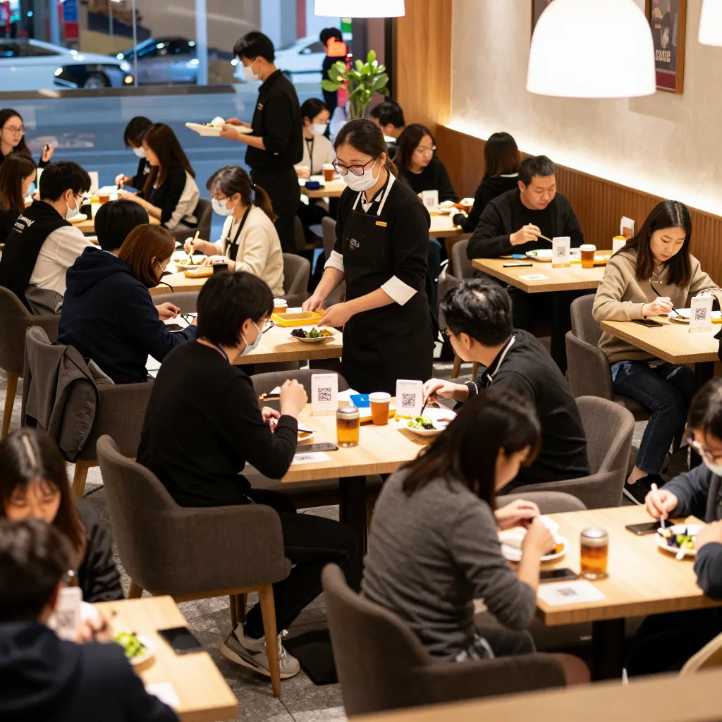
Consider the scenario of a busy Friday night. A customer sits down, pulls out their phone, and scans the code. They are likely standing up or moving around, perhaps holding a drink or using two hands to type. Your design must accommodate this friction. Large touch targets, high-contrast text, and a streamlined navigation structure are not just aesthetic choices; they are functional necessities that respect the user's time and effort. By optimizing for the lowest common denominatorolder devices and smaller screensyou ensure that every guest, regardless of their tech literacy or device choice, can enjoy your menu without frustration.
Optimizing Load Speeds for Low-Bandwidth Environments
Speed is the single most critical technical factor in QR menu performance. In a restaurant setting, you cannot assume every guest has a premium, unlimited data plan. Many users are on metered data, or they may be connecting to a weak cellular signal while waiting for a table. If your menu image gallery is heavy with uncompressed photos, the page could take ten seconds or more to load, causing immediate drop-offs.
To solve this, you must adopt a lightweight design philosophy. This involves compressing all images without sacrificing quality. Tools can reduce image file sizes by up to 80% while maintaining visual fidelity. Furthermore, implement lazy loading techniques where images only appear as the user scrolls down the page. This ensures the core contentyour menu items and pricesis visible immediately, while secondary assets load in the background.
Another vital consideration is the size of your image files. Avoid hosting massive 4K images on a page designed for a 1080p screen. Instead, serve appropriately sized images that match the device's resolution. Additionally, minimize the number of external scripts and tracking pixels that slow down the rendering process. Every millisecond counts. A menu that loads in under two seconds, even on a 3G connection, signals to the user that your business is efficient and modern. This technical optimization directly correlates with higher conversion rates, as users are more likely to order from a menu that feels responsive and snappy.
Typography and Readability: The Art of Clarity
Once a user lands on your menu, the next hurdle is readability. Mobile screens have limited real estate, and users often scan menus quickly while standing or seated in dimly lit dining rooms. Poor typography is the leading cause of user frustration on digital menus. Small font sizes, low contrast between text and background, and complex fonts make it difficult for users to read your offerings without squinting or zooming.
Best practices for mobile typography include using a font size of at least 16 pixels for body text to prevent users from needing to pinch-to-zoom. Headings should be significantly larger to create a clear visual hierarchy. Stick to sans-serif fonts like Roboto, Open Sans, or Helvetica, which render crisply on most digital screens. These fonts are engineered for legibility on small devices and do not have the intricate serifs that can blur on low-resolution displays.
Contrast is equally important. Ensure your text stands out against the background. If you choose a dark background for a sleek, modern look, use a light, high-contrast color for the text, such as white or off-white. Avoid placing light gray text on a dark gray background, as this creates a 'vibration' effect that strains the eyes. Similarly, avoid using images as backgrounds for text-heavy sections, as this reduces contrast and makes reading nearly impossible. By prioritizing legibility, you remove barriers to ordering. When a customer can instantly read the description and price of a dish, they are more likely to add it to their order, reducing the cognitive load required to make a decision.
Navigation Structures That Adapt to Small Screens
Navigation on a desktop website can rely on sprawling sidebars and hover menus, but these elements are useless on a smartphone. A QR menu must rely on a thumb-friendly navigation structure that fits within the 'safe area' of the screen, avoiding content that gets cut off by the device's status bar or home indicator. The most effective navigation pattern for mobile menus is a simple, sticky header or footer that remains visible as the user scrolls.
Categorization is key to managing complex menus. Instead of listing hundreds of items in a single long list, which can be overwhelming, group items into logical categories like 'Starters', 'Mains', 'Desserts', and 'Drinks'. Use clear, bold headings for these categories to help users scan quickly. If you have a large menu, consider implementing a search bar prominently at the top of the page. Many users arrive with a specific craving in mind and want to jump straight to that item. A search function that filters items in real-time is a powerful tool that enhances the user experience significantly.
Buttons and interactive elements must be large enough to be tapped accurately. The average finger is about 10mm wide, so touch targets should be at least 44x44 pixels. Place these buttons within easy reach of the thumb, avoiding areas near the bottom edge of the screen that might be obscured by the phone's physical home button or gesture bar. Furthermore, ensure that the 'Add to Order' or 'Order Now' buttons are distinct and use a color that draws the eye. A cluttered navigation menu with too many links can confuse users, leading to them leaving the page. Keep the menu structure simple: a few clear categories, a robust search bar, and a direct path to ordering are the trifecta of successful mobile navigation.
Accessibility and Inclusivity in Digital Dining
An inclusive QR menu design ensures that your restaurant is accessible to everyone, including those with visual or motor impairments. This is not just a nice-to-have feature; it is a legal requirement in many jurisdictions and a moral imperative for any forward-thinking business. Designing for accessibility often improves the experience for all users, such as those with slower internet connections or older devices.
To make your menu accessible, ensure that all images have descriptive alternative text (alt text) that describes the dish for screen reader users who are visually impaired. This allows the menu to be navigable for the blind and low-vision community. Additionally, provide a text-only version of your menu or ensure that your site is compatible with screen readers like VoiceOver on iOS or TalkBack on Android. This means using proper heading structures (H1, H2, H3) and avoiding decorative elements that screen readers might try to read aloud.
Motor accessibility is another crucial aspect. Users with limited dexterity may struggle with small buttons or complex gestures. As mentioned earlier, large touch targets and clear, distinct actions are essential. Avoid requiring users to swipe in specific directions to navigate; instead, use clear tap-based interactions. By adhering to accessibility standards like WCAG (Web Content Accessibility Guidelines), you demonstrate that your brand values inclusivity. This can positively impact your reputation and expand your customer base to include people who might otherwise be excluded from the digital dining experience. Remember, a menu that works for everyone is a menu that works for everyone.
Conclusion
Designing a QR menu that works on every smartphone is about more than just aesthetics; it is about delivering a seamless, fast, and inclusive experience that turns casual browsers into loyal customers. By prioritizing load speeds, optimizing typography, simplifying navigation, and embracing accessibility, you create a digital dining environment that respects your guests' time and needs. In a competitive market, the difference between a successful restaurant and a struggling one often lies in the small details of the user experience.
This is where upQR steps in as the ultimate solution. Our platform is built from the ground up with these mobile-first principles in mind. We handle the complex technical aspects of image optimization, responsive design, and accessibility compliance automatically, allowing you to focus on curating your menu and serving your guests. With upQR, you get a menu that loads instantly on any device, looks great on any screen, and converts visitors into orders effortlessly. Don't let a poorly designed menu hold your business back. Upgrade to upQR today and ensure your digital presence is as welcoming and efficient as your physical dining room.
Related Posts
Ready to create your digital menu?
Create your QR menu in minutes and reach your customers in any language.